 Web to code extension
 Twitter
 GitHub
 Blog
Blog
User Experience Basics – What Every Designer and Builder Needs to Know in 202616 min read
Reading Time: 11 minutesIn 2026, anyone can generate a user interface in minutes. Tools like Bolt, Lovable, v0, and Replit let you type a prompt, hit enter, and get a working app. But here’s the uncomfortable truth: most of those apps feel the same. Same layout. Same purple gradient. Same generic buttons that could belong to any product — or no product at all.
That’s not a UX problem caused by new technology. It’s an old UX problem amplified by new technology. The fundamentals of user experience haven’t changed — understanding users, designing for clarity, building with intention. What’s changed is how urgently those fundamentals matter when the speed of building has outpaced the quality of thinking behind it.
A new wave of tools is starting to address this gap. Google Stitch, Claude Design, Anima, and Anima’s Figma AI agent ‘Buddy‘ each take a different approach — but they all recognize that generating code isn’t enough if the result doesn’t feel intentional. Some focus on rapid visual exploration, others on bringing design system awareness and brand context into the AI building process so the output actually looks like your product. The tooling is catching up, but regardless of which tool you use, the UX fundamentals in this guide are what separate products people use once from products they come back to.
This guide covers user experience basics from the ground up: what UX actually means, the principles that make it work, how the design process functions, and how to write design prompts that lead to better results.
What Is User Experience (UX)?
User experience is how someone feels when interacting with a product — but that definition, while common, is incomplete. Don Norman, who coined the term while at Apple, defined it more broadly: UX encompasses everything that touches your experience with a product, even when you’re not directly using it. It includes how you discover it, what you expect before you open it, how it performs while you’re in it, and what you remember after you close it.
For digital products, UX means the full arc of interaction: onboarding, navigation, task completion, error handling, and even the confidence with which someone can explain your product to a colleague. The interface is one part of this system — an important part, but not the whole picture.
Jesse James Garrett’s model breaks UX into five layers: strategy (who are you designing for and why), scope (what features and content to include), structure (how information is organized), skeleton (the layout of interface elements), and surface (the visual design users see). Each layer shapes the one above it. Skip the bottom layers, and the surface — no matter how polished — won’t hold up.
The key insight: good UX is invisible. When it works, users think about the outcome they’re trying to achieve, not the product helping them achieve it.
UX vs. UI — The Difference That Still Confuses People
UX and UI get used interchangeably, but they describe different things. UI (user interface) is the visual and interactive layer — typography, color, spacing, buttons, icons, animations. It’s what users see and touch. UX is the larger system that determines whether the product actually works for the person using it.
A useful way to think about it: UI is how the product looks, UX is how it works. You can have a stunning interface that frustrates users because the information architecture is broken. You can also have a highly functional product with great UX that looks outdated and fails to build trust. Neither extreme works. The best products get both right.
In practice, a UX designer focuses on research, user flows, wireframes, and testing. A UI designer focuses on visual hierarchy, brand consistency, and the polish of every interactive element. On small teams, one person often handles both — which is fine as long as the distinction stays clear in the process. Research and structure come first. Visuals follow.
Core UX Design Principles — Your Checklist
Jakob Nielsen’s usability heuristics remain the gold standard for evaluating any interface. Here’s each one as an action item you can apply today:
-
Show system status. Always tell users what’s happening — loading indicators, confirmation messages, progress bars. If your AI feature takes 10 seconds to generate something, show a progress state, not a blank screen.
-
Speak your user’s language. If your audience calls it a “project,” don’t label it a “workspace.” Audit every label, button, and menu item against real user vocabulary.
-
Give users control. Add undo, redo, cancel, and clear exit paths everywhere. When AI generates a design or output, users should be able to reject it and go back without losing their work.
-
Stay consistent. Search bar at the top. Familiar icons. Same interaction patterns across screens. Every time you break a convention, you force users to relearn something.
-
Prevent errors before they happen. Disable submit buttons until required fields are filled. Add confirmation dialogs for destructive actions. Use smart defaults to reduce the decisions users have to make.
-
Recognition over recall. Show recent items, surface relevant options, keep key context visible. Don’t make users remember information from one screen to use on another.
-
Design for both beginners and power users. Provide walkthroughs for new users and keyboard shortcuts for experts. Both should feel the product was built for them.
-
Every element earns its place. If something on screen doesn’t help the user complete their current task, remove it. But don’t strip away labels or navigation for the sake of minimalism — that hurts usability.
-
Write helpful error messages. “Something went wrong” is useless. “We couldn’t save your file because it’s too large — try reducing the image size” tells users exactly what to do next.
-
Provide inline help. Tooltips, contextual guides, and searchable docs beat a separate FAQ page. Help should appear where and when the user needs it.
The UX Design Process — 5 Steps
Good UX follows a loop: understand the problem, explore solutions, build something testable, validate with real users, iterate. Here’s each step as an action plan.
-
Research your users. Interview them. Survey them. Read their support tickets. Study how they currently solve the problem you’re designing for. Build personas grounded in real behavior, not assumptions. The output is clarity — who they are, what they need, where they’re stuck.
-
Define the problem, then ideate. Write a specific problem statement: not “users are confused” but “new users can’t find the export function, causing 40% to drop off before first value.” Then brainstorm multiple solutions before committing to one. Sketches, whiteboard sessions, and “How Might We” exercises keep you from fixating on the first idea.
-
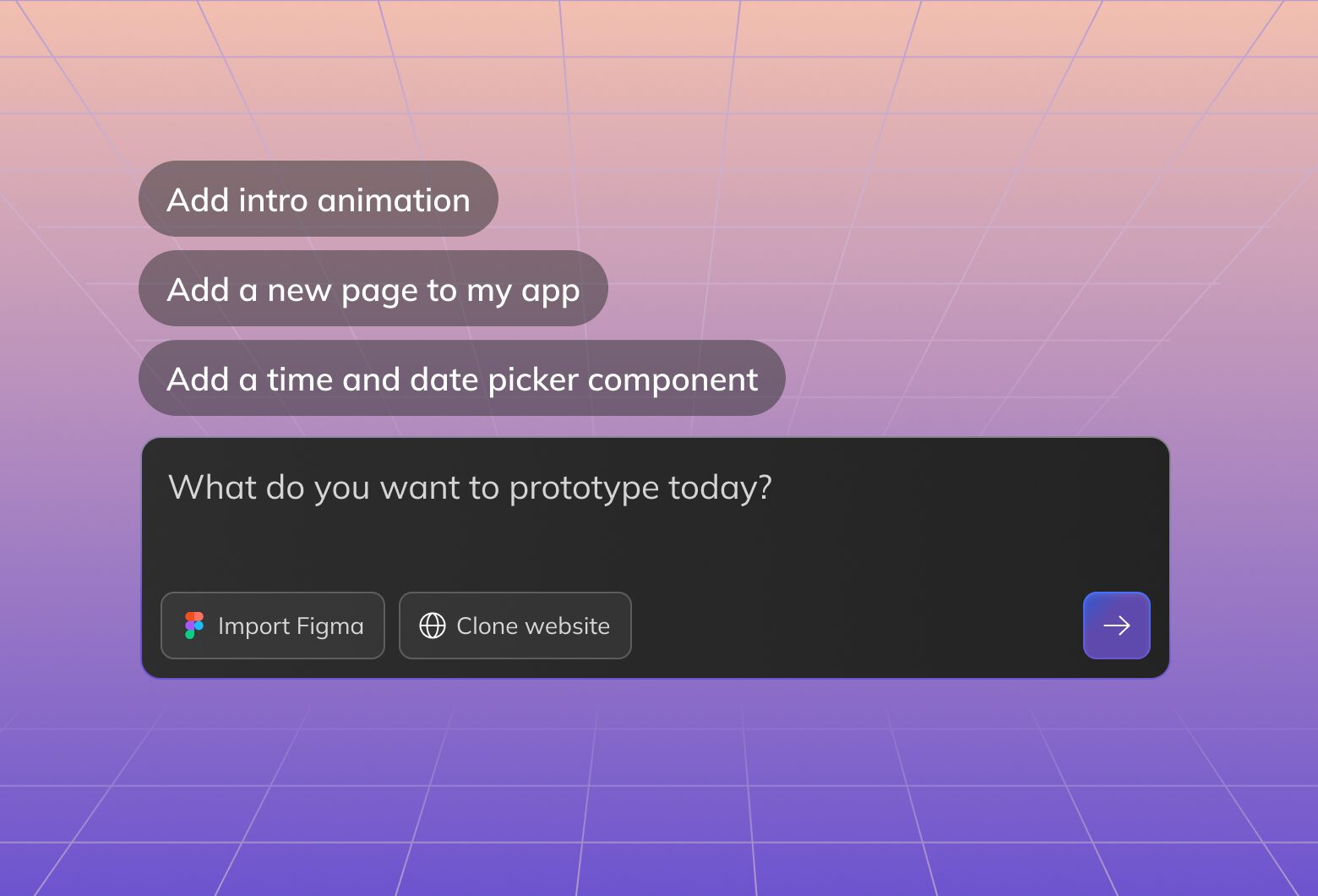
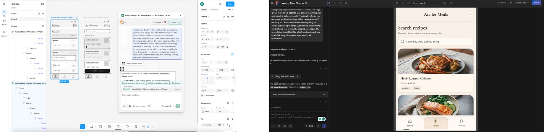
Wireframe and prototype — fast. Sketch low-fidelity layouts focused on structure, not polish. Then build something interactive. In 2026, this step takes minutes, not days. AI design agents like Anima Playground generate working prototypes from a prompt — with real interactions, not static screens. If you work in Figma, Buddy — Anima’s AI agent for Figma lets you wireframe and iterate directly on the canvas without leaving your workflow.

Wireframe with Buddy in FigmaPrototype in Anima Playground -
Test with real users. Put your prototype in front of five people. Watch where they hesitate, where they click wrong, where they succeed. Moderated sessions, unmoderated remote tests, or even informal coffee-shop testing — all work. The key: test early and often, not once at the end. With tools like Anima, your prototype is a shareable live URL — users interact with a real working product, so the feedback reflects actual behavior.
-
Iterate, ship, keep monitoring. Fix the biggest friction points first. Then ship — and track task completion rates, time-on-task, error rates, and satisfaction scores. UX design doesn’t end at release. Every session generates data for the next improvement.
Why UX Basics Matter More in the Age of AI
Here’s the paradox of 2026: building has never been faster, but the average quality of what’s being built hasn’t kept pace. AI tools can generate a complete interface from a text prompt in seconds. They can write the code, set up the routing, deploy it live. What they can’t do — at least not on their own — is think about the user.
AI-generated interfaces tend to have a few recurring problems. Layouts default to the same patterns. Color palettes cluster around the same safe choices. Typography, spacing, and component design lack the intentional variation that makes a product feel like this brand versus any brand. This is sometimes called the “AI slope” — the gap between what’s technically functional and what’s actually well-designed.
The UX fundamentals covered in this guide are exactly what’s needed to close that gap. When you understand user research, you know what questions to ask before generating anything. When you know the principles of consistency and recognition, you can evaluate AI output critically instead of accepting the first thing it produces. When you have a real design process — even a fast one — you’re making intentional decisions rather than letting the AI make them for you.
This is where the relationship between human judgment and AI speed becomes practical. The designers and builders who understand UX basics will use AI to move faster without losing quality. The ones who don’t will ship faster and wonder why nobody comes back.
Applying UX Principles When Building With AI Tools
If you’re using AI tools to build interfaces — whether it’s a simple landing page or a full product — here’s how to apply UX basics to get better results.
Start With Context, Not Just a Prompt
The biggest mistake in AI-assisted building is jumping straight to “build me a dashboard.” Without context, the AI has no constraints — and unconstrained AI produces generic output. Instead, define your user, the task they’re performing, and the brand context before you prompt anything.
Some tools are built to handle this. Anima, for example, lets you feed in a design system or reference a brand from an existing website, so the AI generates interfaces that actually match your visual identity — not a generic template. Whether you use a tool like that or simply write more specific prompts, the principle is the same: the more design context the AI has, the less generic the output.
Evaluate AI Output Against UX Heuristics
After the AI generates something, don’t just check if it “looks good.” Run through Nielsen’s heuristics:
- Is the system status visible? (Are loading states, confirmations, and errors handled?)
- Does the language match your users’ vocabulary?
- Can users undo actions easily?
- Is the layout consistent across screens?
- Are errors prevented or clearly explained?
This takes five minutes and catches issues that would otherwise ship to production.
Maintain Design System Consistency
If your product has an existing design system, make sure AI-generated screens respect it. Mismatched components, inconsistent spacing, or off-brand colors break trust with users — even if they can’t articulate why something feels “off.”
Tools that integrate with design systems like Anima help enforce this automatically. For example, teams can vibe code with their Figma design system so generated screens stay closer to existing components and tokens. If you’re working without such a tool, keep a checklist: typography, color tokens, spacing scale, component variants. Check every AI-generated screen against it.
Test With Real Users, Not Just Your Team
AI tools make it tempting to build and ship in a single session. Resist that temptation for anything user-facing. Even one round of testing with five users will reveal assumptions the AI baked into the interface that don’t match real user behavior.
The good news: testing is easier than ever when your prototypes are real, working apps instead of static mockups. With Anima, what you build is a shareable, interactive prototype with a live URL — you can send it to users and watch them interact with an actual working product, not a clickable wireframe. That means the feedback you get reflects real behavior, not guesswork about how a mockup might feel.
How to Write a Design Prompt That Actually Applies UX Principles
Knowing UX principles is one thing. Baking them into what you build is another. If you’re using AI tools to create interfaces, the quality of your prompt determines whether the output follows UX basics or ignores them entirely.
Here’s a framework for writing design prompts that produce better results — based on the principles covered above.
1. Define the user and their goal first
Bad prompt: “Build me a dashboard.” Better prompt: “Build a dashboard for a marketing manager who needs to check campaign performance every morning. Their primary action is comparing this week’s metrics to last week’s.”
Why it works: This applies the user-centricity principle. The AI now knows who the user is and what they’re trying to do, which shapes layout, hierarchy, and which data to surface first.
2. Specify the brand context
Bad prompt: “Make it look modern and clean.” Better prompt: “Use the brand style of [your-website.com] — match the colors, typography, and visual tone. The audience is enterprise buyers, so the design should feel professional and trustworthy, not playful.”
Why it works: This applies consistency and standards. Without brand context, AI defaults to generic purple gradients and startup-style UI. With context, it produces something that looks like your product.
3. Describe the key interactions, not just the layout
Bad prompt: “Create a settings page.” Better prompt: “Create a settings page where users can update their profile info and notification preferences. Changes should save automatically with a visible confirmation. Include an option to undo the last change.”
Why it works: This applies visibility of system status, user control and freedom, and error prevention — all in one prompt. You’re telling the AI how the page should behave, not just how it should look.
4. Include constraints and edge cases
Bad prompt: “Design a signup form.” Better prompt: “Design a signup form with email and password. Disable the submit button until both fields are valid. Show inline validation errors as the user types — use plain language, not error codes. Add a ‘Show password’ toggle.”
Why it works: This applies error prevention, help users recover from errors, and recognition over recall. The more edge cases you define upfront, the fewer UX issues you’ll need to fix after generation.
5. State the user’s experience level
Bad prompt: “Build an analytics tool.” Better prompt: “Build an analytics tool for first-time users who aren’t data analysts. Include a guided walkthrough for the first session, tooltips on key metrics, and a ‘quick start’ preset that shows the most common report without configuration.”
Why it works: This applies flexibility and efficiency of use and help and documentation. You’re designing for the actual skill level of your audience, not assuming expertise.
Try Designing with Anima
Anima creates websites, apps and UX design from a prompt, try it here –
Common UX Mistakes to Avoid
A few patterns come up repeatedly in products with poor UX. Being aware of them helps you catch problems before they reach users.
Mistaking “simple” for “minimal.” Simplicity means making the right information easy to find. Minimalism for its own sake — removing labels, hiding navigation, using icons without text — often makes things harder to use, not easier.
Designing for yourself instead of your users. What’s intuitive to you (the person who built it) is not necessarily intuitive to someone encountering it for the first time. This is why user testing exists — to surface the gap between builder assumptions and user reality.
Ignoring accessibility. Accessible design isn’t optional — it’s part of UX. Readable text sizes, sufficient color contrast, keyboard navigation, and screen reader support expand your audience and improve the experience for everyone, not just users with disabilities.
Treating UX as a one-time project. UX is iterative. The first version of anything is a hypothesis. Real user data after launch tells you what’s actually working. Build a habit of monitoring, testing, and refining continuously.
Over-relying on data without user empathy. Analytics tell you what users do. They don’t tell you why. Quantitative data needs qualitative context — interviews, surveys, session recordings — to lead to genuine UX improvements.
Frequently Asked Questions
What are the 5 elements of user experience?
Jesse James Garrett’s model identifies five layers: strategy (user needs and business goals), scope (features and content requirements), structure (information architecture and interaction design), skeleton (interface layout and navigation), and surface (visual design). Each layer builds on the one below it — you can’t create a great surface without a solid structure underneath.
What is the difference between UX and UI?
UX (user experience) is the entire system of interactions a person has with a product — from discovering it to using it daily. UI (user interface) is the visual and interactive layer: buttons, colors, typography, and layout. UI is a component of UX, but UX extends to information architecture, user research, content, performance, and the overall feeling of using a product.
Do UX basics still apply when using AI design tools?
Absolutely — in fact, they matter more. AI tools accelerate the building phase but can’t replace the thinking phase. Understanding user needs, applying design principles, maintaining brand consistency, and testing with real users are all human responsibilities that determine whether an AI-generated product actually works for the people using it.
What tools do UX designers use in 2026?
The UX toolkit in 2026 looks different than it did even a year ago. Figma remains the foundation for design and prototyping — and with AI agents like Buddy by Anima, you can now generate wireframes, screens, and flows directly on the Figma canvas through conversation. Beyond Figma, Claude Design is popular for fast visual concepts and mockups, and Google Stitch focuses on rapid UI exploration for mobile and web. Anima Playground takes it further — generating full working prototypes with brand consistency, design system awareness, and shareable live URLs, so you go from idea to testable product in minutes.
Conclusion
User experience basics haven’t changed in their essence — understand users, design with intention, test with real people, and iterate. What’s changed is the environment: AI can now generate interfaces faster than ever, which makes these fundamentals more important, not less.
The designers and builders who combine UX thinking with AI speed will build products that stand out — not because they shipped first, but because they shipped something people actually want to use.
If you’re looking to build with AI while keeping your designs on-brand and user-centered, try Anima’s Playground — it’s built for exactly this challenge.