 Figma
 API
 Web to code extension
 Adobe XD
 Discord
 Twitter
 GitHub


 Blog

Visual Design Principles: 8 Rules That Make Interfaces Easier to Use10 min read
Reading Time: 7 minutesVisual design principles are rules of attention and organization, not a checklist for making every screen look trendy. Scale, hierarchy, contrast, alignment, proximity, balance, repetition, and whitespace help people see what matters, understand what belongs together, and act with confidence. The test is not whether a composition looks polished in a portfolio. It is whether someone can find the next step in the actual interface.
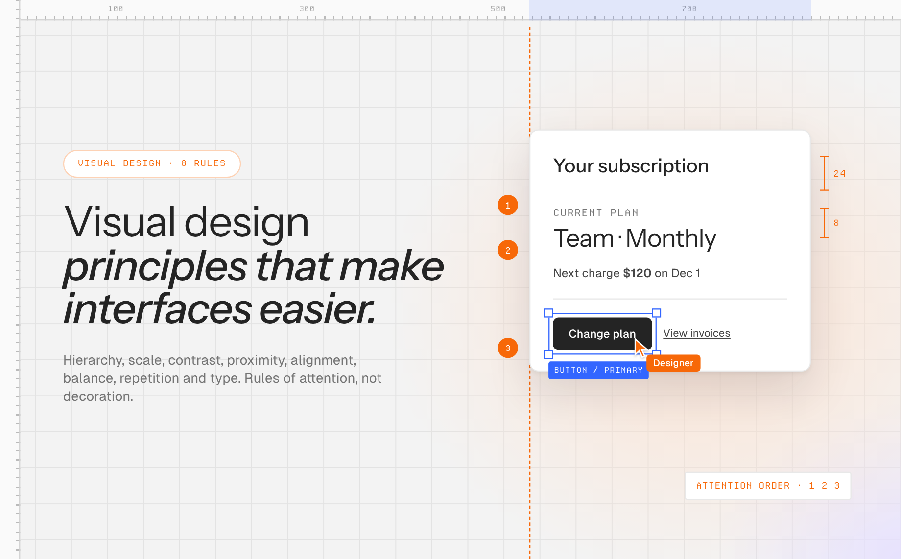
Consider a dashboard with a large decorative chart, a tiny “Resolve incident” action, and three equally loud alert colors. The problem is not that it needs more decoration. The visual priorities contradict the user’s task. This guide shows how to diagnose and fix such problems with one concrete subscription-settings example.
Anima Playground can turn a prompt or Figma design into an editable web interface, giving you a live place to test a new hierarchy at desktop and mobile widths. If you use AI to draft a screen, the principles still belong to the designer: inspect the result, supply brand context, and revise what does not serve the task.
Apply the principles now: build a settings screen in Anima Playground, then compare your first version with a revision that changes only hierarchy, grouping, and contrast.
What are visual design principles?
They are repeatable ways of arranging type, color, shape, and space so an interface communicates. Nielsen Norman Group’s visual-design guide focuses on scale, hierarchy, balance, contrast, and Gestalt grouping. Adobe’s design-principles article also calls out alignment, repetition, proximity, space, and color. The lists vary, but the practical question is stable: what should a person notice, understand, and do?
Use these principles together. A large button is not truly prominent if every other card is just as bright. Related fields do not feel related if a large gap separates them. Consistency makes patterns recognizable, while selective contrast signals an exception. The sections below treat each principle as a decision you can inspect on a real screen.
1. Visual hierarchy: set an order of attention
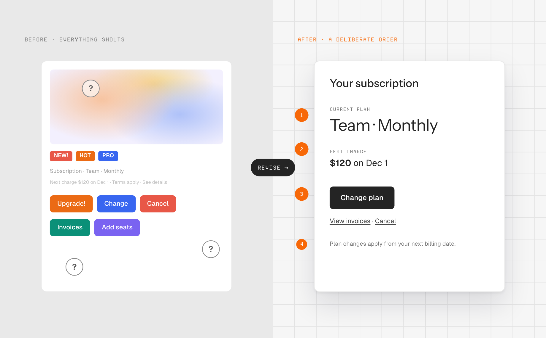
Hierarchy tells someone what to read first, second, and third. On a subscription page, the current plan and renewal date should be apparent before a menu of upgrade options. A useful first pass is to write the intended reading order as a list: Current plan → next charge → available change → confirmation details. Then blur or squint at the page. If a decorative illustration dominates before the plan name, your visual hierarchy does not match your information hierarchy.
Headings, position, spacing, color, and emphasis all contribute. Avoid solving every priority with bold text. One page-level heading, clear section headings, and a restrained primary action often communicate more than six competing accents. NN/g’s visual-hierarchy explanation connects size and color with grouping and common regions.
2. Scale: make importance visible without making everything big
Scale is relative size. A 32-pixel heading means little if every label is almost as large; a smaller but isolated heading can still lead. Choose a short type scale for the page, then reserve the largest treatment for the screen’s main question. On our settings screen, “Your subscription” might be the heading, while the annual-price comparison should be prominent enough to compare but not mistaken for the current amount owed.
Test at a narrow viewport. A large desktop headline may wrap into five lines on a phone and bury the action below the fold. Reduce size or shorten copy while preserving the order of importance. For broader product-context checks, see Anima’s guide to UX basics; visual polish should support an understandable flow, not compensate for one that is missing.
3. Contrast: distinguish actions and make text readable
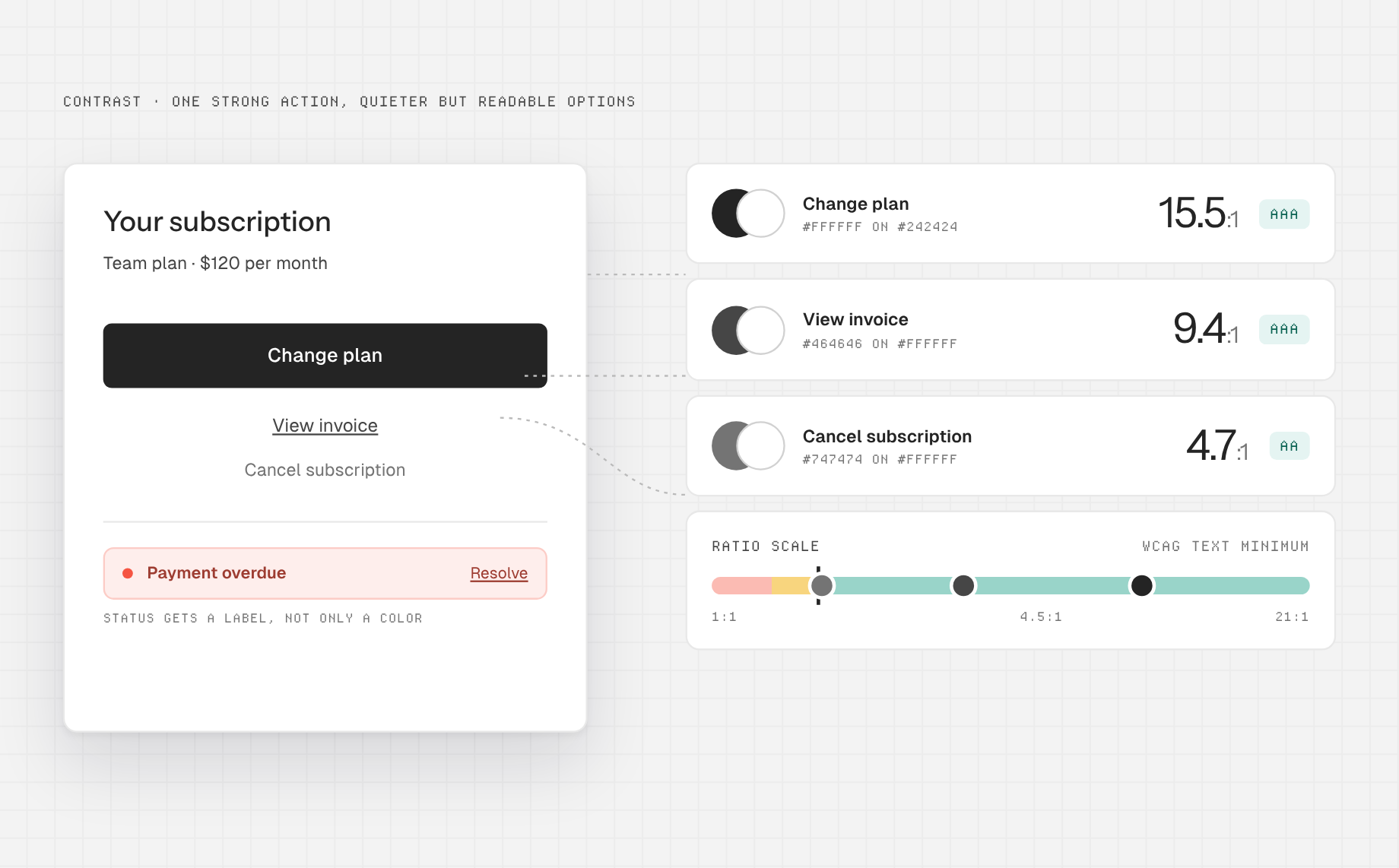
Contrast is difference in lightness, size, shape, or other visual properties. Use it to separate a primary “Change plan” action from secondary “View invoice” and “Cancel” links. But visual emphasis must remain legible. W3C’s WCAG guidance specifies at least 4.5:1 contrast for ordinary text and 3:1 for large text under the Level AA criterion, with defined exceptions. Check actual foreground and background colors, including hover states, rather than judging a palette by eye. Disabled controls are an exception to this particular minimum-text-contrast requirement, but should still be identifiable in context.
Color should not carry the entire message. If an overdue payment is shown only by red text, add a clear status label and a path to resolve it. A single high-contrast primary action is easier to spot than a row of identical bright buttons.
4. Proximity: group what belongs together
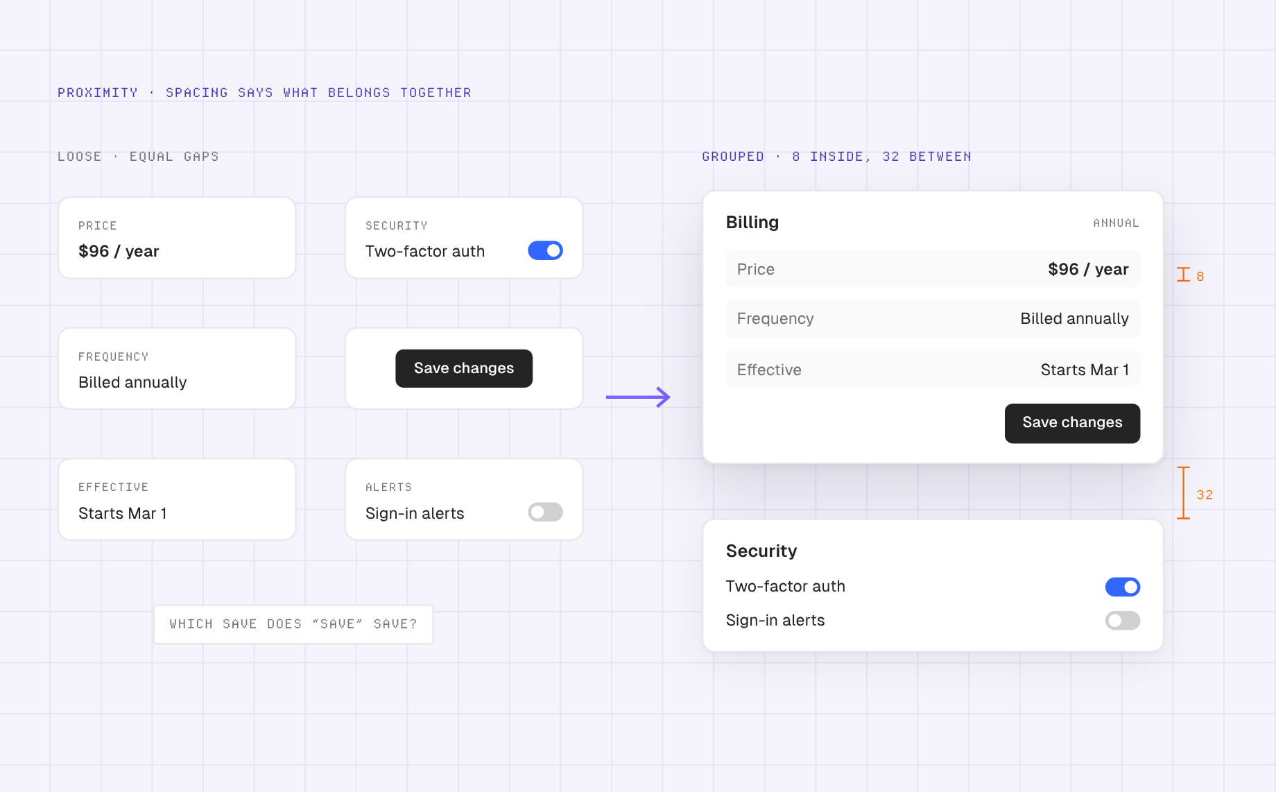
The proximity principle says nearby elements tend to be perceived as related. Put the annual price, billing frequency, and effective-date explanation in one group. Leave a larger gap before account-security controls. If the “Save changes” button is closer to a cancellation warning than to the plan form, people may read it as the wrong action.
A practical test: hide all borders and background cards for a moment. Can spacing alone still reveal the groups? If not, the layout may be depending on decoration to fix a structural problem. On mobile, check grouping again after columns stack; two desktop cards can accidentally merge into one long, ambiguous block.
5. Alignment: make scanning predictable
Alignment creates a shared visual line for text, controls, and data. In a plan comparison, put plan names on one axis and prices on another so a person can compare without hunting. For a form, align labels consistently and keep validation messages adjacent to their field. A single card shifted a few pixels may seem harmless, but repeated misalignment makes scanning more work.
Alignment is not a command to center everything. Left-aligned body text is generally easier to follow in content-heavy product UI, while a centered short hero can work on a landing page. Choose alignment for the reading task and apply it consistently across breakpoints.
6. Balance and whitespace: distribute weight without filling every gap
Balance does not require symmetry. A wide text column can balance a smaller, stronger illustration if neither blocks the task. On the subscription page, the current-plan summary might occupy the wider side while a compact next-charge card sits beside it. At mobile width, stacking those sections usually makes more sense than shrinking both.
Whitespace is functional: it separates groups, makes a primary action easier to locate, and gives dense data room to breathe. But empty space can also disconnect a label from its value. Compare the space inside a related group with the space between groups. The latter should normally be more decisive. Do not use giant vertical gaps simply to make an unfinished page feel premium.
7. Repetition and similarity: teach a pattern once
If three settings rows perform comparable actions, give them comparable structure, type treatment, and control placement. NN/g explains similarity as a cue that elements share a relationship. Repeated styling helps users predict behavior; breaking the pattern tells them something differs. Use that difference intentionally for a destructive action, not because screens were assembled from unrelated templates.
Design tokens and components make repetition operational rather than manual. Anima’s Figma design-system import can bring component variants, variables, and styles into a Playground for new UI. That is helpful for consistency, but a component library cannot decide whether the wrong action is most prominent. This design-system workflow shows how existing components can inform new screens. Review the page-level hierarchy as well as token fidelity.
8. Typography and color: turn the system into a readable voice
Typography conveys structure through size, weight, line length, and spacing. Set a clear distinction between heading, supporting copy, labels, and metadata; avoid using a tiny gray font to make a crowded layout fit. Write labels that say what a control does. “Change billing frequency” is more informative than “Manage.”
Color can carry brand personality and state, but its semantic role should be stable. If purple is your primary action in one screen, do not use the same purple for a noninteractive badge elsewhere. Give success, warning, and error states text labels and sufficient contrast. A useful design system records these decisions so the next screen does not restart them.
A practical visual-design audit you can run in 20 minutes
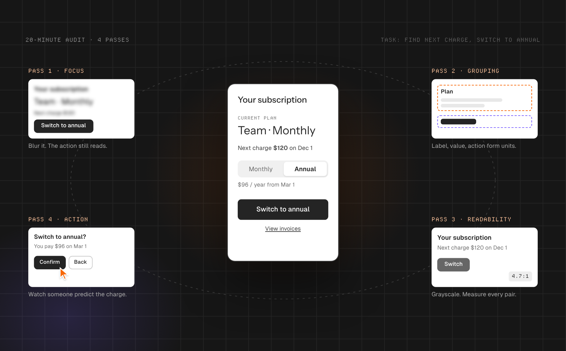
- State the user task. For example: “Find the next charge and switch from monthly to annual billing.” Do not begin with “make it cleaner.”
- Write the intended attention order. Current plan, price difference, effective date, primary action, confirmation. Mark anything decorative that interrupts this order.
- Perform a grayscale and blur pass. If the action disappears without color, adjust size, placement, or whitespace. If everything shouts equally, remove emphasis from secondary content.
- Inspect grouping and alignment. Check whether each label, value, explanation, and action forms a coherent unit. Repeat at mobile width, where columns and cards change order.
- Check contrast and states. Measure text/background pairs against the relevant WCAG criterion; inspect focus, error, hover, and disabled states. A pretty default state is not a complete UI.
- Ask someone to complete the task without guidance. Observe what they notice first and what charge they think will occur. Revise the screen based on that evidence, not on whether they compliment its look.
If the first design came from AI, provide the actual task, user priority, brand colors, type and spacing conventions, and the intended mobile behavior in the next prompt. In Anima Playground you can select a preview element and request a targeted change instead of regenerating the whole page. If your starting point is an early sketch, compare wireframing tools before committing to high-fidelity visual treatment.
Common mistakes when applying visual design principles
- Making every action primary. A bright button is not a shortcut to hierarchy when there are four of them.
- Using contrast only for aesthetics. Measure readability and distinguish states with labels as well as color.
- Copying a spacing system without examining relationships. Equal gaps everywhere can make unrelated sections look connected and related fields look separate.
- Equating minimalism with clarity. Removing labels or important billing details may produce a quieter mockup and a worse decision.
- Assuming desktop decisions survive mobile. Recheck order, line breaks, tap targets, and action placement on the narrow version.
Frequently asked questions
Which visual design principle matters most?
Start with hierarchy: can the user see the information and action needed for the task? Contrast, proximity, scale, and alignment then reinforce that order. The priority changes with context, but decoration should never override comprehension.
Are visual design principles the same as UX principles?
Visual principles govern how elements are arranged and perceived. UX also covers needs, content, flows, feedback, errors, and outcomes. A beautiful page can still fail if its steps or language do not make sense.
Can AI apply visual design principles automatically?
AI can generate layouts and use supplied design-system context, but it cannot independently validate your user’s goals or the meaning of every interaction. Give it task and brand constraints, then inspect hierarchy, accessibility, behavior, and user feedback yourself.
Put the audit to work: draft a screen in Anima Playground, make one deliberate hierarchy change, and test whether someone finds the right next step faster.