 Figma
 API
 Web to code extension
 Adobe XD
 Discord
 Twitter
 GitHub


 Blog

User Interface Design: Principles, Process, and a Practical Checklist8 min read
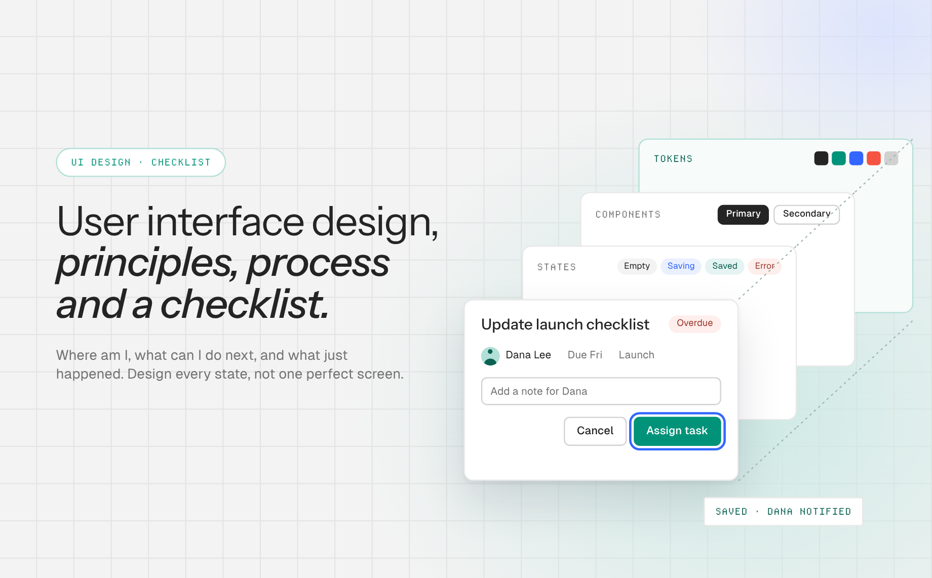
Reading Time: 6 minutesUser interface design is the practice of shaping the screens, controls, content, and feedback people use to complete a task in a digital product. A good interface tells people where they are, what they can do next, and what happened after they acted. It is not simply a pleasing color palette.
For a team designing an online user interface, the hard part is making those decisions hold together across screens and states. A polished dashboard can still fail if its filter labels are unclear, its form errors are hidden, or its mobile layout buries the main action.
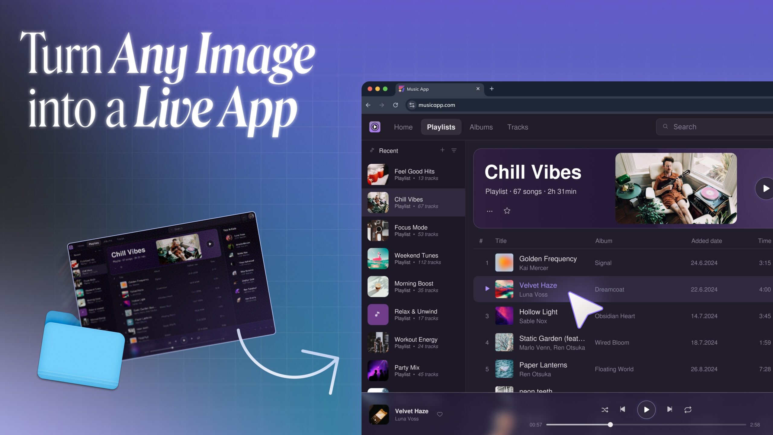
Anima Playground can turn a prompt or Figma design into an editable, responsive web prototype so you can test the interface as a flow rather than judge a single static frame.
Prototype your interface in Anima Playground, then use the checks below to improve it.
What does user interface design include?
UI design covers the visible surface and the behavior of that surface: information hierarchy, navigation, typography, color, spacing, interactive components, microcopy, and states such as loading, empty, success, and error. UX design is broader. It includes the research and end-to-end experience that define which problem the interface should solve. If you need the broader foundation, start with our guide to user experience basics.
Consider a project-management screen. The UX question is whether a teammate can find and update the right task without losing context. UI decisions include whether the project name anchors the page, how a task’s status is shown, where the edit action sits, and what confirmation appears after a save. The distinction matters because beautiful controls cannot repair a missing step in the task flow.
Start with the task, not a collection of screens
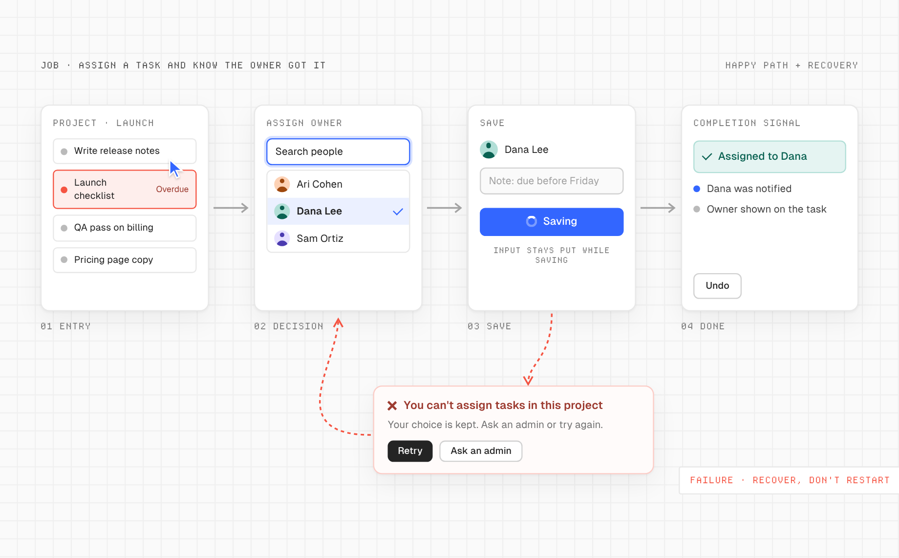
Write a one-sentence job: “A first-time manager needs to assign a task and know the owner received it.” Then identify the entry point, essential decision, completion signal, and likely failure. Sketch the path before polishing the screen. Our user-flows guide shows how to map decisions and edge cases.
For that assignment flow, list at least four states: no assignee selected, assignee selected, save in progress, and assignment saved. Add a failure state for a permissions problem or network interruption. This is the difference between drawing a button and designing an interaction.
Seven principles that make an interface usable
1. Make the primary action easy to recognize
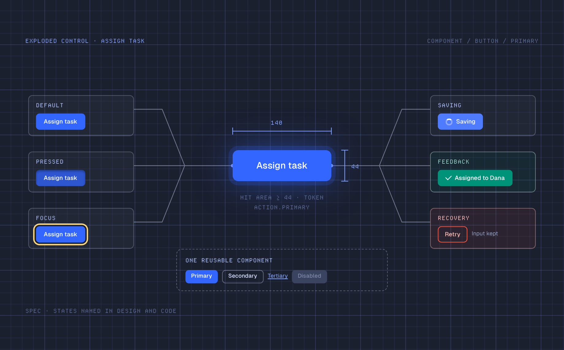
Each screen should have a clear next step. Use layout, scale, and contrast to distinguish the main action from secondary options. Nielsen Norman Group’s visual hierarchy explanation is a useful test: can a person tell what matters before reading every label? If every card, badge, and button shouts equally, nothing has priority.
2. Use familiar language and patterns
Call a task a “task” if that is what your users call it. Make controls behave consistently across pages. A link should not look like plain text on one screen and a button on another without a reason. The Nielsen Norman Group usability heuristics emphasize feedback, real-world language, user control, consistency, and error recovery. Treat those as review questions, not decorative theory.
3. Design feedback and recovery alongside the happy path
After “Save,” show whether the action succeeded. During a delay, show that work is in progress. If saving fails, preserve entered data and explain what can be tried next. A toast that disappears before a person can read it is not a complete error strategy. For risky actions, provide confirmation or a reversible path where appropriate.
4. Build a small, reusable visual system
Define type roles, spacing increments, colors, component variants, and interaction states before multiplying screens. A design token makes a decision repeatable in both design and code. Material Design’s foundation guidance connects tokens, layout, accessibility, and interaction states. Your brand can be distinctive without asking every screen to invent new rules.
5. Treat accessibility as a design input
Use descriptive labels, visible keyboard focus, readable text, sufficient contrast, and controls with comfortable touch areas. For web interfaces, WCAG 2.2 specifies a 4.5:1 minimum contrast ratio for ordinary text at Level AA, with a 3:1 threshold for large text, plus criteria for focus and pointer targets. Do not confuse the WCAG 24-by-24 CSS-pixel minimum target criterion, which has exceptions, with a recommendation that all controls should be that small. Test the actual UI with keyboard and assistive technology, not just a visual checker.
6. Adapt the layout, not just the dimensions
A dense desktop table may need a card or prioritized summary at a narrow width. Decide which information remains visible, which action moves, and how navigation changes. On an online user interface, resize the browser and test with real content, long labels, localization, and zoom. A compressed desktop screen is not a mobile design.
7. Keep the design connected to implementation
Document component behavior and state names, not only colors. Name Figma layers and use Auto Layout when possible. Anima’s Figma import guidance explains why structured frames, meaningful names, and variables help translate a design into editable web code. If the result diverges, inspect the rendered screen and revise the component rather than declaring the mockup done.
A practical user interface design workflow
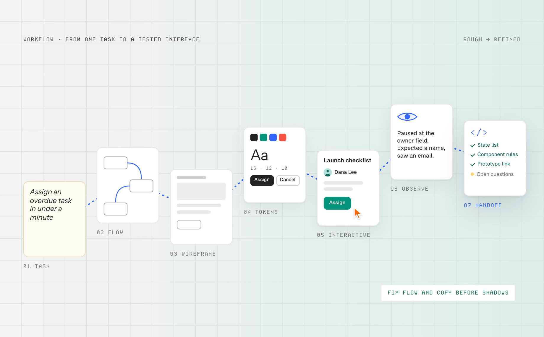
- Define one measurable task. Pick a user, context, action, and completion signal. For example: “From the project list, assign an overdue task in under a minute.”
- Map the flow and content. Identify entry and exit points, decisions, permission constraints, and what information each step needs. Do not add a screen just because a template has one.
- Wireframe the key screens. Use rough blocks and real labels. Review hierarchy and navigation before tuning colors. Compare an empty state with a populated state.
- Set components and tokens. Define button hierarchy, form fields, cards, typography, spacing, focus, disabled, loading, and error variants. If you already have a Figma library, see how to build with your Figma design system.
- Make it interactive. Start with a prompt or import a Figma frame into Anima Playground, then ask for the missing screens and states. Preview the actual task on desktop and mobile widths. The output is a web prototype with editable code, not proof of production readiness.
- Observe a task attempt. Ask someone unfamiliar with the design to perform the task without hints. Record where they hesitate, what they expect to happen, and whether the completion signal is clear. Change the flow or copy before polishing shadows.
- Review the handoff. Give engineering the prototype, component rules, state list, and unresolved questions. Inspect the implemented UI again with real data and edge cases.
For a concrete Playground prompt: “Design a responsive project task screen for a small team. Show task owner, due date, status, and one primary Assign action. Include empty, saving, saved, and permission-error states. Use clear labels and visible focus states. Do not hide essential actions on narrow screens.” Review the generated result against your actual users and design system.
UI design checklist before you ship
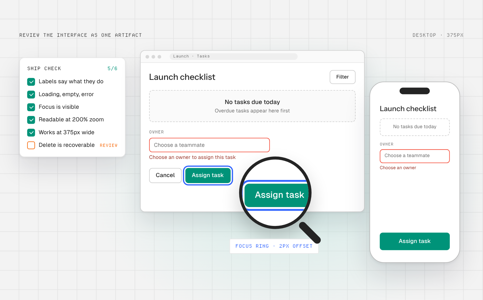
- Can a new user state the page’s purpose and primary action?
- Are labels specific, consistent, and understandable without icons alone?
- Do loading, empty, success, validation, and error states exist?
- Can users navigate with a keyboard, perceive focus, and read text at zoom?
- Does the layout work with long content and narrow viewports?
- Are destructive actions recoverable or clearly confirmed?
- Do components follow the design system in both design and running code?
Common UI design mistakes
Polish before structure: a beautiful first screen hides a confusing path. Map the task first. Icon-only controls: they save space but can obscure meaning, especially for uncommon actions. Add labels where clarity matters. One perfect sample state: it avoids the empty database, long names, and failed requests people will actually see. Inconsistent AI output: prompt-generated screens may use different spacing and component conventions unless you supply and review a design system.
Frequently asked questions
What is the difference between UI and UX design?
UI design shapes the interface people see and operate. UX design covers the broader journey, research, task structure, and outcomes. The two overlap: an unclear button is a UI problem that creates a UX problem.
What are the most important UI design principles?
Clear hierarchy, predictable navigation, consistent components, useful feedback, accessible interaction, and recoverable errors are reliable starting points. The right priority depends on the task and users, so test the interface rather than optimizing a checklist in isolation.
Can AI design a complete user interface?
AI can accelerate drafts and working web prototypes. It still needs a specific task, brand context, state requirements, accessibility checks, and feedback from users. Treat a generated screen as an hypothesis to evaluate, not a signed-off solution.
Good user interface design makes the next action obvious and the result trustworthy. Build a testable web UI in Anima Playground, then iterate on the real flow with the people who will use it.